The Daily Fail: David Rose's newest cherry-pick.
David Rose, who is no stranger to cherry-picking climate data and then weaving artful tales based on those cherry-picks, is back with yet another example of his perversity. This time, he's trumpeting a 2-year increase in Arctic sea ice as measured on a single day: August 25, 2012 vs. August 25, 2014, claiming a 43% increase based on those two very specific days. This is misleading for multiple reasons, one of which he himself admits in small type under that large flashy graphic at the top of his article:
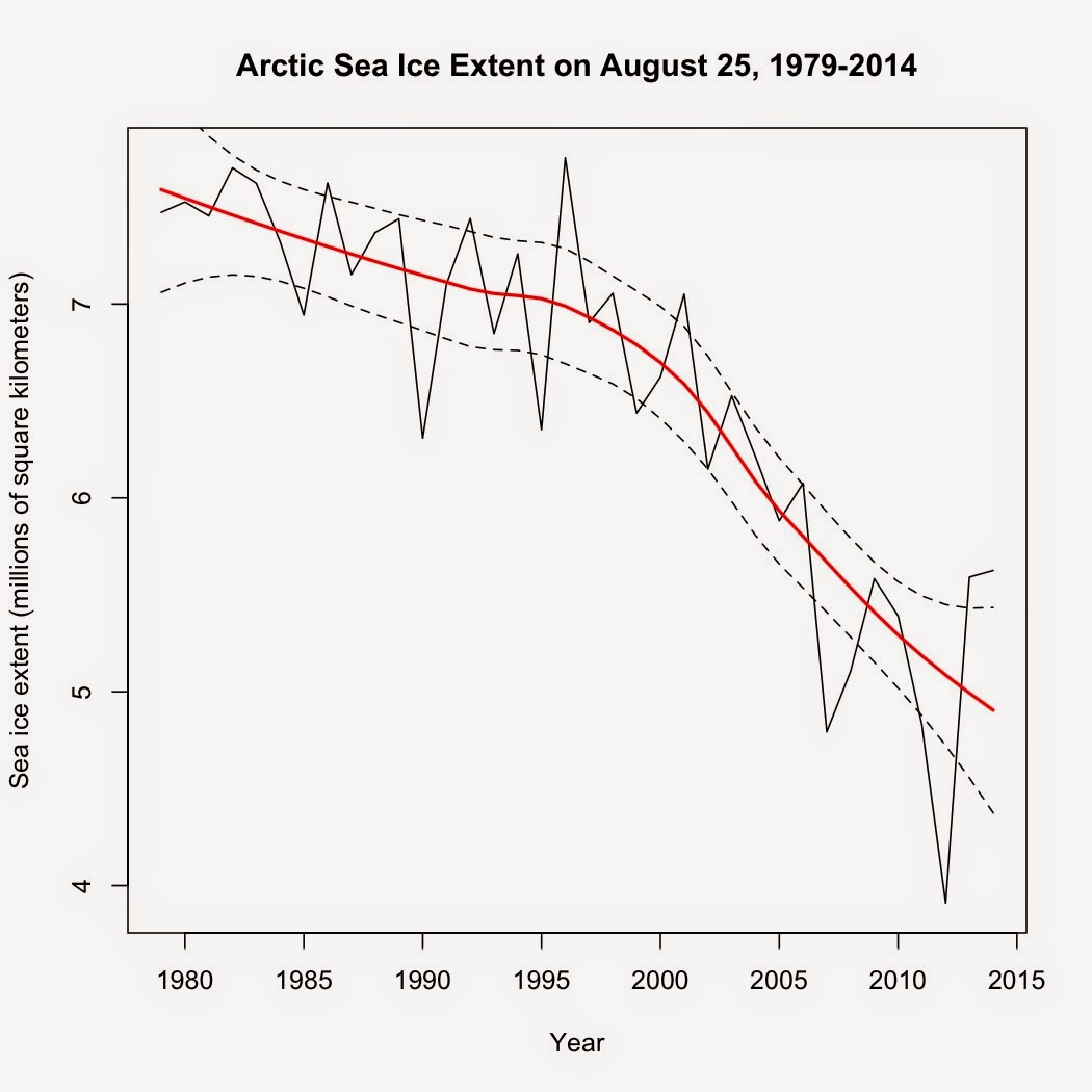
To generate this graph, I simply downloaded the NSIDC Arctic sea ice data and plotted August 25 sea ice extent. When data for August 25 was missing, I simply averaged the data for August 24 and August 26 to extrapolate the extent on August 25. I've added a loess smooth and 95% confidence intervals to highlight the trend.
Is it any wonder why Rose wants to focus on the increase since 2012 while giving little more than lip service to the long-term trend? The long-term data shows that August 25, 2014 had the 8th lowest extent on that date of the satellite record. The long-term trend? Still firmly negative. So why the focus on the increase since 2012? Simple. It's the part of the satellite record that he could spin to fit his narrative. It wouldn't fit his "all is well" narrative if he admitted that the Aug. 25, 2014 extent represented a loss of 1.9 million square kilometers from the same day in 1979. It's the equivalent of a gambler claiming an increase of 43% when he wins back $17 while ignoring the fact that he lost a total of $36 before his win.
He also claims that the ice is thicker and implies that ice volume has recovered but didn't show the data on that, merely relying on the colors in the satellite image while utterly ignoring the trend in ice volume. Examining the data shows why.

The take-home message from the volume data? That the ice has "recovered" enough to get back up to the trend. The last few years, volume had been declining faster than the overall trend. Now? It's right at the trend. Not quite the picture of a "recovery" that Rose attempts to paint.
I'll leave the final word to Dr. Ed Hawkins, who Rose quoted near the end of his article.
"These reveal that – while the long-term trend still shows a decline – last Monday, August 25, the area of the Arctic Ocean with at least 15 per cent ice cover was 5.62 million square kilometres." (emphasis added).So, just what does that long-term trend show? This:
To generate this graph, I simply downloaded the NSIDC Arctic sea ice data and plotted August 25 sea ice extent. When data for August 25 was missing, I simply averaged the data for August 24 and August 26 to extrapolate the extent on August 25. I've added a loess smooth and 95% confidence intervals to highlight the trend.
Is it any wonder why Rose wants to focus on the increase since 2012 while giving little more than lip service to the long-term trend? The long-term data shows that August 25, 2014 had the 8th lowest extent on that date of the satellite record. The long-term trend? Still firmly negative. So why the focus on the increase since 2012? Simple. It's the part of the satellite record that he could spin to fit his narrative. It wouldn't fit his "all is well" narrative if he admitted that the Aug. 25, 2014 extent represented a loss of 1.9 million square kilometers from the same day in 1979. It's the equivalent of a gambler claiming an increase of 43% when he wins back $17 while ignoring the fact that he lost a total of $36 before his win.
He also claims that the ice is thicker and implies that ice volume has recovered but didn't show the data on that, merely relying on the colors in the satellite image while utterly ignoring the trend in ice volume. Examining the data shows why.
The take-home message from the volume data? That the ice has "recovered" enough to get back up to the trend. The last few years, volume had been declining faster than the overall trend. Now? It's right at the trend. Not quite the picture of a "recovery" that Rose attempts to paint.
I'll leave the final word to Dr. Ed Hawkins, who Rose quoted near the end of his article.
That is a hilarious quote for Rose to include, as Rose spent his entire article trying to do just what Hawkins warned against."Dr Hawkins warned against reading too much into ice increase over the past two years on the grounds that 2012 was an ‘extreme low’, triggered by freak weather.
‘I’m uncomfortable with the idea of people saying the ice has bounced back,’ he said."


Comments
Post a Comment